
As I’ve been preparing for my workshop at the CCDA conference this October in Detroit (“How Boring Data can be Exciting, Troubling, and Action-oriented”), I’m reminded again of the importance of searching and digging for truth. Sure, I can keep my blinders on and just enjoy the trendy coffee shops, restaurants, bike share bikes, and public transportation of my hometown of Portland, Oregon. I sort of fit in: I make my own kombucha and abhor Starbucks, but lack the requisite long beard and tattoos. What is missing as I bike and walk and take the light-rail through Portland enjoying the summer neighborhood scenes? What is missing if I simply hang out with people who look and act like me? What is missing as I run into fewer and fewer Portlanders who have lived here longer than 5 or 10 years? Story and context are missing, and without this, we can’t truly engage with our community.
Of course, looking at data doesn’t replace the need for relationship and personal connection. The data isn’t the story, but it can uncover and illuminate a story. And often that story is hidden from the collective consciousness of current residents, so even walking the streets and talking to people (a valuable and irreplaceable activity) won’t uncover the story that may be lurking below the surface.
For example, take a look at figure 1 below which shows the dispersal of those in poverty from the central city of Portland in 1990 to East Portland in 2015 (darker colors indicate higher levels of poverty). What is going on?

Figure 1: Dispersal of those in poverty from central city to deep east Portland, 1990 to 2015
Figure 2 below provides more clues as we see that Portland’s already small African-American population in 1990 was displaced from inner Portland neighborhoods, with no majority black neighborhoods remaining in 2015 (darker colors indicate higher percentage of Black residents).
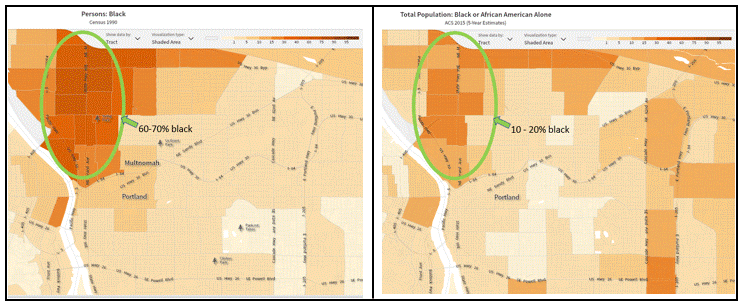
Figure 2: Displacement of Portland’s African American population from 1990 to 2015
And finally, figure 3 below shows us that since 1990, immigrants have been coming to Portland, but settling in the outer suburbs (darker colors indicate higher percentages of immigrant residents).

Figure 3: Immigrants forced to settle in Portland’s outer suburbs 1990 – 2015.
Portland’s Ring of Affluent Whiteness
The result? A literal “ring of affluent whiteness” in Portland’s most popular, geographically central, amenity-rich neighborhoods. However, the changes you can literally see in the maps above are hidden from the casual observer. Some may ask, “so what”? Perhaps people are just living where they want to live, and who’s to say living in a central neighborhood is more desirable than living in an outer suburb? One way to approach this question of desirability is to look at relative access to amenities such as public transportation, grocery stores, and parks. Figure 4 below shows the loss of amenities very clearly as you move from central Portland (the “ring of affluent whiteness”) to East Portland.

Figure 4: The loss of amenities from Central Portland to East Portland.
Do your own research!
The good news is that data is plentiful and with a little bit of work, you can start putting your city’s story together. For an overview of a variety of data bases, including those used above, check out the database summaries I’ve prepared to help you do your own detective work. As mentioned above, the data isn’t the whole story, but it can help provide context and uncover trends that remain hidden from those who don’t dig.
