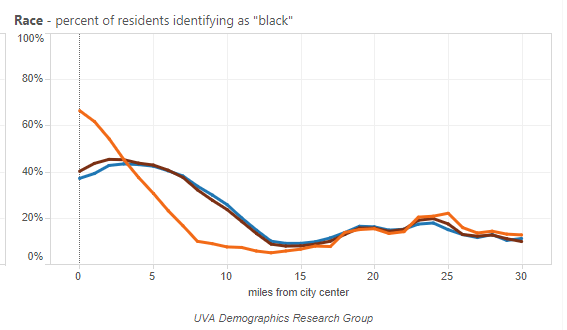
Changing Shape of America’s Metro Areas
Summary: How does your metro area change as you move from the city center outward? Includes data such as educational attainment, per capita income, youth/elderly percentages, race, poverty levels, population levels and densities, rent vs own. Shows changes over time from 1990 to 2012.
http://statchatva.org/changing-shape-of-american-cities/
Sample charts:


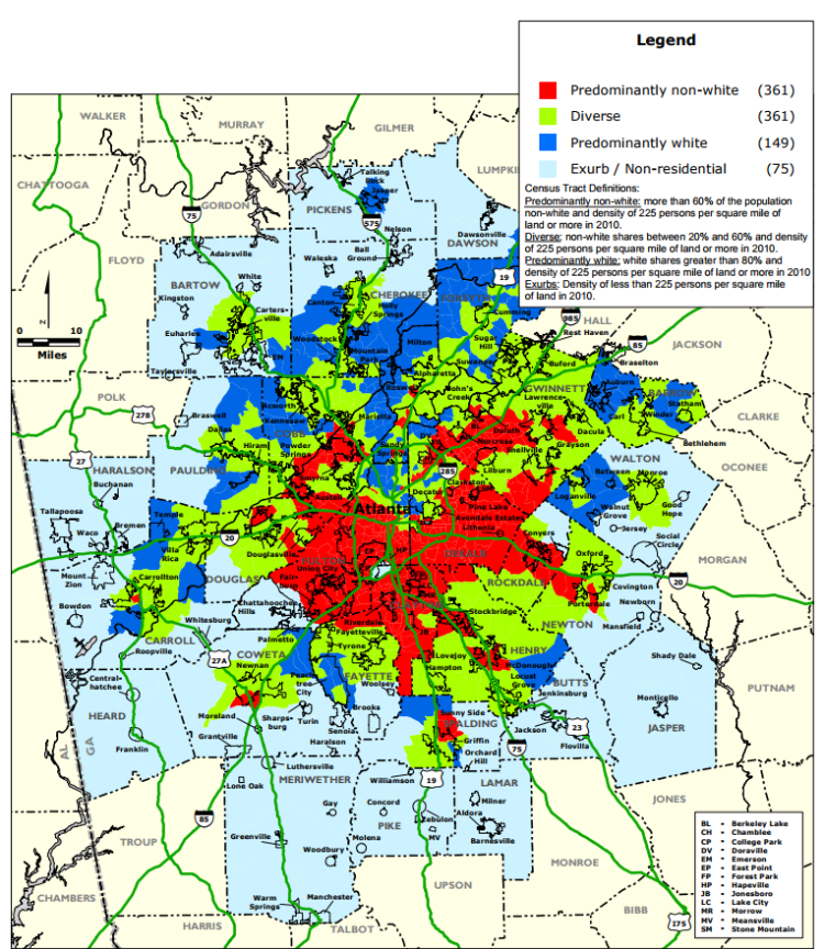
Institute on Metropolitan Opportunity
Summary: Provides variety of data and analysis for 50 largest metro areas. Includes data on community diversity, elementary free lunch participation, jobs per resident, affordable housing availability, voting/party preferences.
https://www.law.umn.edu/institute-metropolitan-opportunity/metro-area-maps-data
Sample maps:

Social Explorer
Summary: Provides a visual interface to loads of data including US Census, demographics, crime, business patterns, health, and religion. This is a for-fee service, available for $100/month (cancellable during 7-day free trial period, month-to-month subscription). Well worth the price! [Note I have no relationship with this company]. Includes historic data so you can make comparisons over time.
https://www.socialexplorer.com
Sample maps:


Association of Religion Data Archives (ARDA)
Summary: Provides high-level information on religious adherence rates, congregational statistics, and church locations.
http://www.thearda.com/rcms2010/
Sample maps:

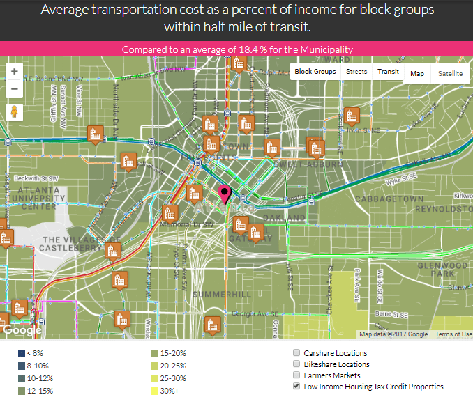
AllTransit Database
Summary: Largest collection of transit connectivity, access, and frequency data for metro areas. Includes maps and stats on number of jobs within ½ mile of transit and within a 30 minute commute.
http://alltransit.cnt.org/metrics/
Sample maps:


Trulia Maps
Summary: A very useful, easy-to-use web mapping tool with a collection of data on crime, schools, amenities. Note that this only provides current information (no historical data – for that see Social Explorer).
Sample maps:


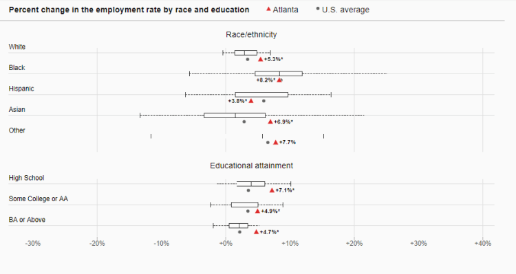
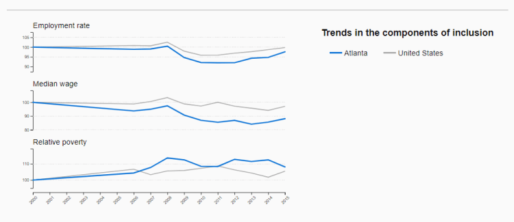
Brookings Metro Monitor 2017 Dashboard
Summary: Provides an economic-oriented overview of most major metropolitan areas in the US. Provides comparisons to US averages. Useful for understanding overall trends and rankings of your metropolitan area in terms of economic opportunity.
https://www.brookings.edu/interactives/metro-monitor-2017-dashboard/
Sample Charts:

Census Reporter
Summary: A very easy to use website to get a snapshot of the area immediately around your address of interest (block group, census tract, school district, up to the entire metro area).
https://censusreporter.org/locate/
Sample Charts:


American Fact Finder – Census.gov – ADVANCED USERS
Summary: A convenient way to access VERY detailed information directly from the US Census Bureau (free of charge). Enter in your address, choose how large or close-in you want to look, and access literally thousands of data sources for your selected geography.
https://factfinder.census.gov/faces/nav/jsf/pages/searchresults.xhtml?ref=addr&refresh=t
US Census Bureau QuickFacts – ADVANCED USERS
Summary: Quickly generate a view that compares your city/zip code to overall city, state, and country. Useful to get perspective on how your area may differ in key characteristics such as demographic makeup, housing, income, and businesses.

One thought on “Database Summaries”